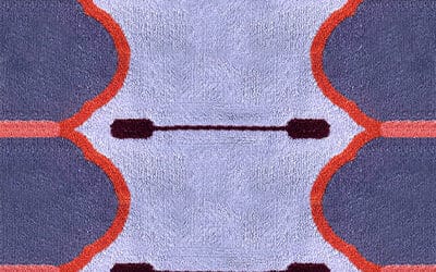
The start of every year sees numerous companies selecting a colour of the year. Self-proclaimed ‘global colour authority for the design community’, Pantone is clearly the best known and most reported on picker of colour, but there is often some debate about the relevance of the company’s selection. This year Pantone has chosen Very Peri or Pantone 17-3938, a shade of periwinkle combing blue with a violet red undertone, a colour that the company claims encourages ‘personal inventiveness and creativity.’
In colour theory, purple is indeed associated with creativity, individuality and leadership, but Pantone’s shade of periwinkle does not sit well with former editor-in-chief of ELLE Decoration UK, Michelle Ogundehin, as can be seen in her recent article for Dezeen. She sees Very Peri as a shade right on the edge of the colour spectrum, making it hard for the eye to see, a colour that agitates and is associated with royalty and the elite. She sees this as a strange choice for the difficult times in which we live. Ogundehin comments ‘Hmmm. So, we need a difficult colour that frustrates and alienates? A colour of individualism and hierarchy? I think not.’
Colour selection is always going to be a subjective business. At a time when the world is in great turmoil, we are more than ever looking for a trend, a colour, an insight that can unite, inspire and uplift. Leading consumer trend forecaster WGSN along with Coloro recently released its five Key Colours for Autumn/Winter 2023/24, one of which is Digital Lavender—not so very different from Very Peri. So, is there perhaps something to this pale purple hue? Perhaps for the rugs of 2023. While colour trends do come and go, I can’t help but wonder whether a single colour can be emblematic of a period of time or if it can help us to deal with a period of time.
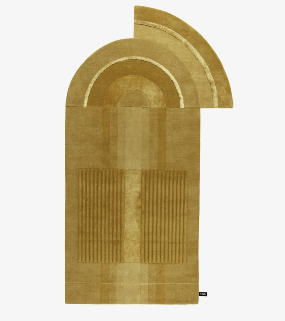
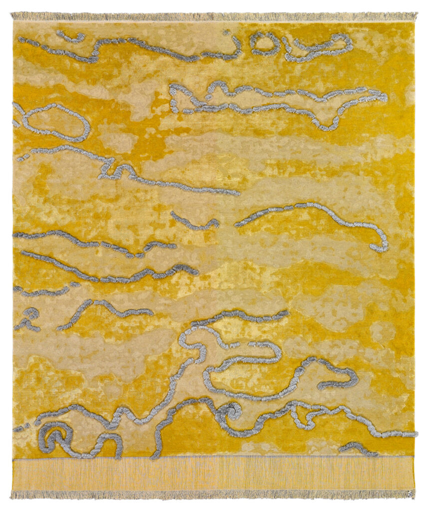
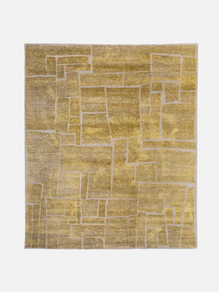
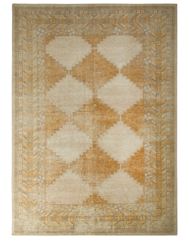
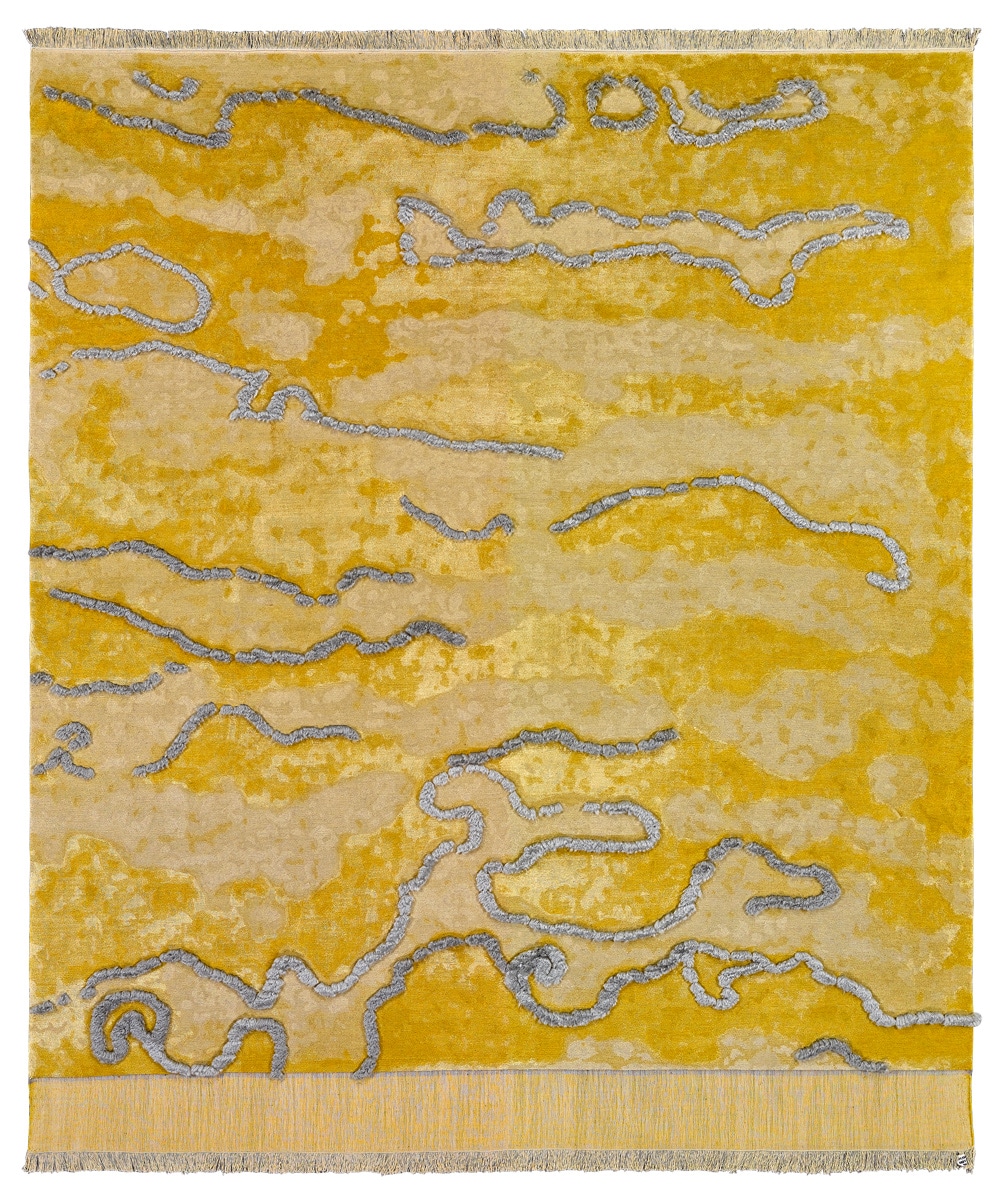
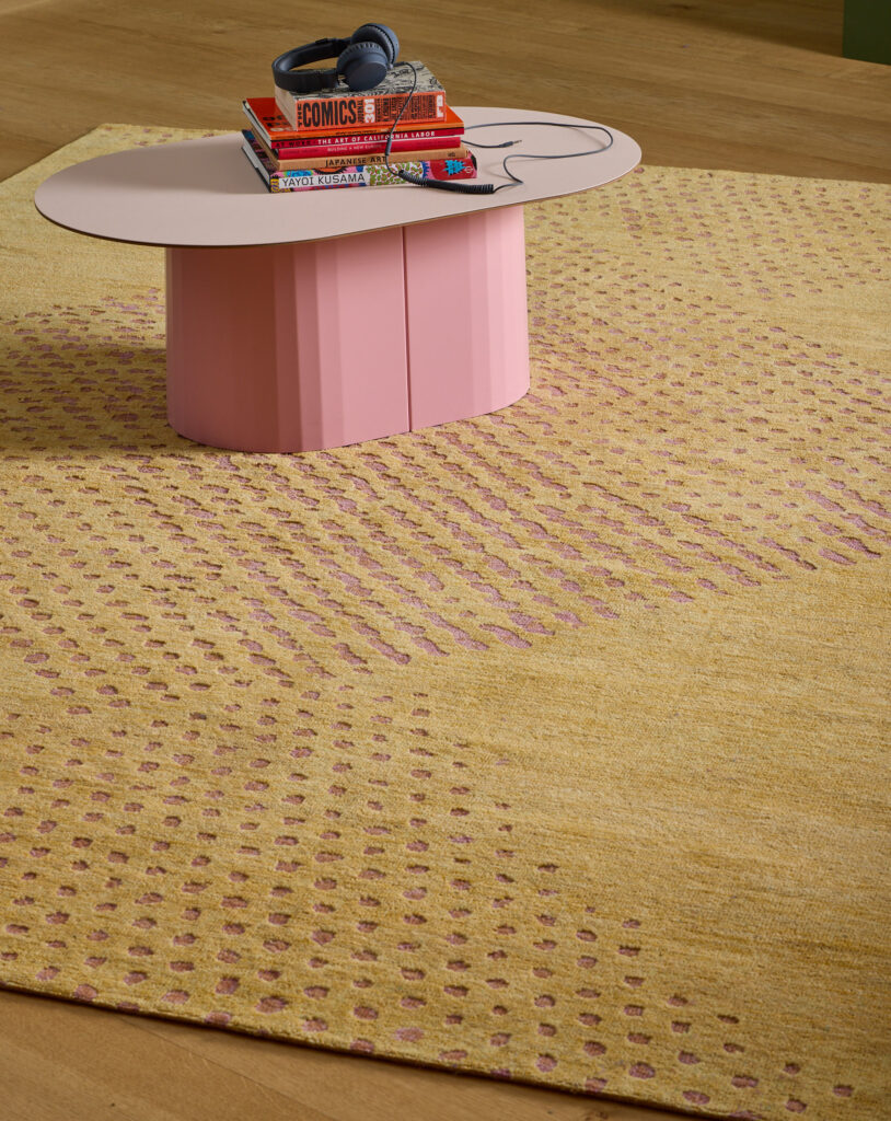
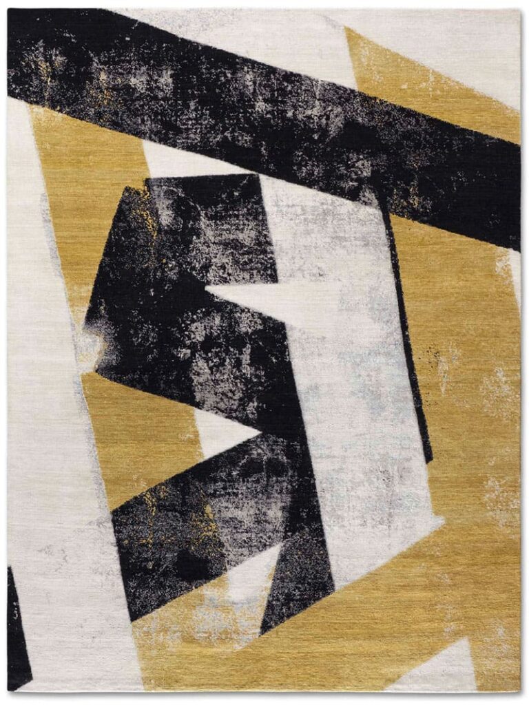
Looking through pages of the last few issues of COVER recently, I noted a great deal of exuberant colour, a large selection of neutrals, and a lot of pastel shades, but very little wool or silk dyed in periwinkle or tones close to it. And so I decided to choose my own colour of 2022, just for rugs. High-end hand-knotted carpets come in every shade under the sun so what was I going to decide on? I have heard a lot of talk of green being big for 2022, a nice calming colour that reflects nature and health (WGSN chose the specific shade of Sage Leaf for 23/24). Or bright and invigorating orange (Apricot Crush says WGSN). With all the above points in mind, I quite randomly decided that my colour of the year will be gold. Once I had made the decision, the more I looked, the more gold rugs I found, and I realised that maybe my choice wasn’t so random after all. For traditional or contemporary, neutrals or colourful, busy or minimal designs, gold works its magic.
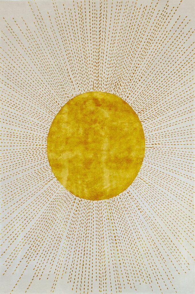
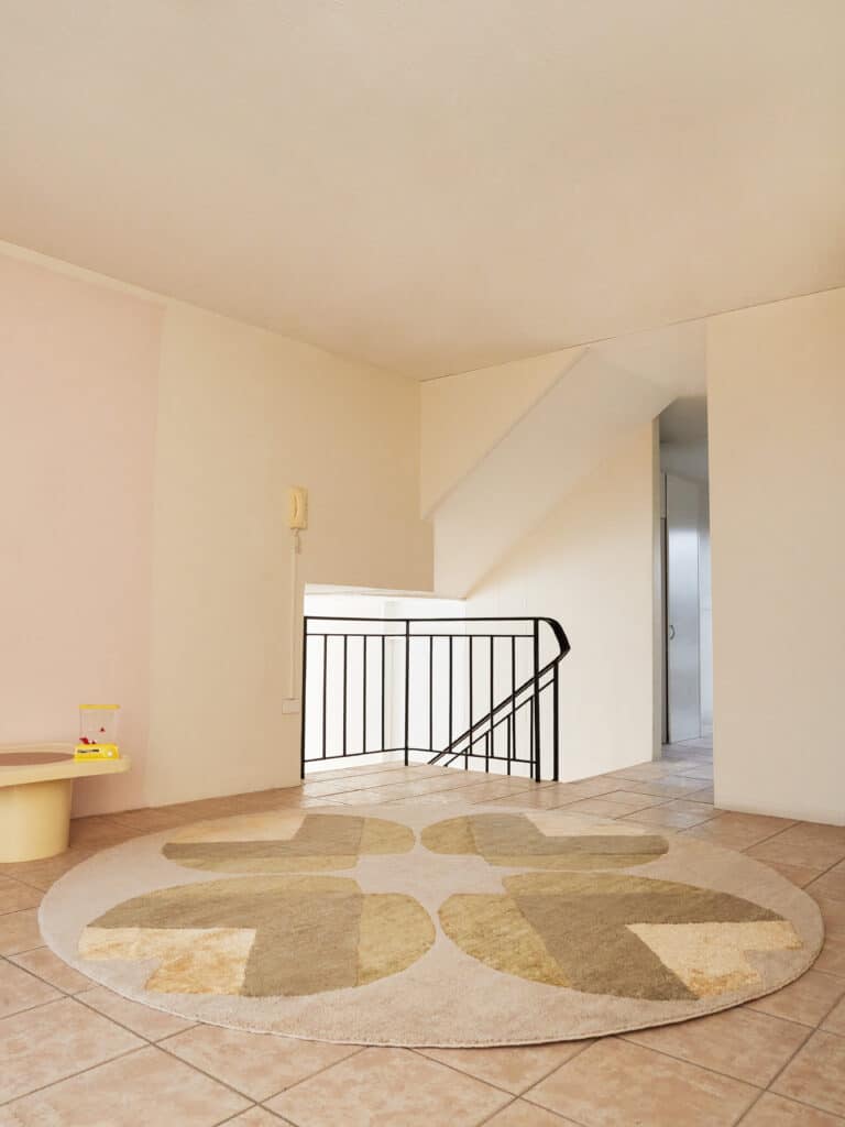
Funnily enough, I then found in my book of colour theory, Colour Healing by Lilian Verner Bonds, that ‘Purple is to be used sparingly. It is a “heavy” colour, and too long an exposure to purple can be depressing….Should anyone have an overload of purple, the antidote is exposure to gold.’ Instinctively I found my antidote to Very Peri.
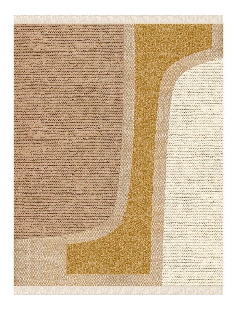
Gold shares similar attributes to the colour yellow, being uplifting and optimistic. Once believed to be the ‘tears of the sun’ by the Incas, gold has been vital to our existence and a symbol of power and wealth for millennia. It has coloured myths and legends like the Golden Fleece and El Dorado, the lost city of gold, illuminated manuscripts and Gustave Klimt’s ‘Golden Phase’ paintings. Today it is seen in the magical gold-coloured highlights in silk in hand-knotted rug designs. Symbolic of success and wealth but also of generosity and compassion, gold is a rich colour that gives confidence. Perhaps it is just what we need for 2022.
